On average, an industry’s Net Promoter Score (NPS) leader outgrew its competitors by a factor greater than two times according to Bain & Company. If you want to be a part of that number, you need to look into measuring and improving your NPS if you aren’t already.
What is a Net Promoter Score?
In 2003, Fred Reichheld and Bain & Company created the Net Promoter Score for the purpose of helping companies measure and evaluate customer loyalty. An NPS metric is created to measure company or product loyalty by sending out a survey asking your customers a single question: “On a scale of 0 to 10, how likely are you to recommend our company’s product or service to a friend or colleague?” Based on their scores, customers are then classified into three categories: promoters, passives, and detractors.
- Promoters score a 9 or a 10 and are considered loyal customers that will keep buying from your company and recommend to friends to do the same.
- Passives score a 7 or an 8 and are considered satisfied but unenthusiastic customers who can be easily lured away by competitors.
- Detractors score a 6 or lower on the scale and are considered unhappy customers who are a churn risk and spread the majority of the bad word of mouth advertising.
Why should you know your Net Promoter Score?
How a customer or consumer answers the NPS question helps your organization gauge how satisfied customers are and can help you gauge the future success of your product or company.
Promoters are responsible for 80% of referrals in most businesses and usually defect at lower rates than other customers (Net Promoter System, 2013). Essentially, promoters have a higher Customer Lifetime Value which means they are more valuable to your company. Naturally, this makes the insights from your net promoter score essential.
What can I learn from Net Promoter Score metrics?
When learning how to calculate NPS, there are a few different NPS metrics that you can create. Here are two of the ways you can visualize your NPS.
YEAR TO DATE NPS & RESPONSES
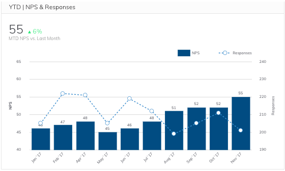
The metric above shows what the NPS was for each month along with how many responses were received from the NPS surveys sent out that month. The blue columns represent the NPS and the dashed line represents the number of responses received.
Viewing this data as a column and line chart makes it easy to compare how your NPS has changed from month to month and how many responses you received each month, which helps you know how reliable your score is. For instance, if your NPS comes back as an 88 one month, but you only had four responses to the NPS survey you sent out, the score is likely not very accurate.
Tracking your NPS from month to month helps you pinpoint what caused your score to rise or fall during a specific time period. That way, you can use the feedback to either fix the problems that occurred or replicate the good efforts that gave your score a boost.
YEAR TO DATE NPS BY RESPONSE TYPE
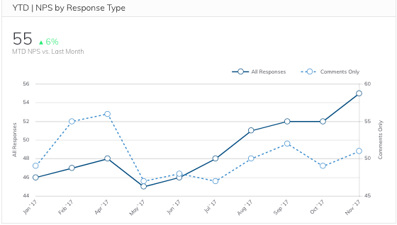
The NPS by Response Type metric allows you to visualize the difference between NPS scores with and without comments. The solid line represents the NPS of all of your survey responses with or without comments. The dotted line represents the NPS of only the surveys that had comments included with them. Viewing this data as a line chart makes it easy to plot and compare the different data.
Even if you receive several responses, your NPS can still be skewed in one direction or the other. This could make you think you are doing better or worse than you actually are which could lead to you searching for problems that don’t exist or keep you from finding problems that need to be fixed. Eventually, your Churn Rate will tell you what people actually think, but you want to be ahead of that so you can continue things trending in the right direction before they’re headed in the wrong one.
One of the ways to gauge the validity of an NPS is to include an extra question on an NPS survey asking people to briefly explain why they chose the score they did. In most cases, scores with this question filled out are probably more accurate because people take the time to explain why they chose the score they did rather than quickly selecting a number without much thought.
Another benefit to adding a question asking people to explain the reason for the score they gave is that it allows you to gather useful information about your product or company so you can know what you are doing well or what needs to be improved.
How do you calculate your Net Promoter Score?
An NPS is calculated by subtracting the percentage of customers who are detractors from the percentage of customers who are promoters. NPS can range anywhere from -100 to 100. A -100 would mean that all of your customers are detractors and a 100 would mean that all of your customers are promoters.
Here’s how you would calculate that. Say you send out an NPS survey and receive 100 responses from customers. Of the 100 customer responses, 25 are detractors, 55 are promoters, and 20 are passives. Now you need to figure out what percentage of your responses are detractors and what percentage are promoters. You won’t do anything with the passives number, so don’t worry about that one.
Here’s what that net promoter score calculation looks like.
# of detractors / # of responses = % that are detractors
# of promoters / # of responses = % that are promoters
% of promoters – % of detractors = NPS
You had 25 detractors so you divide that number by the number of responses received which was 100. You learn 25% of your customers are detractors. You had 55 promoters so you also divide that number by the total number of responses received which is 100. You learn 55% of your customers are promoters. Then you take your percentage of promoters and subtract your percentage of detractors from it. So 55-25 gives you a score of 30. So your NPS would be 30.
What is a good Net Promoter Score?
Having a positive NPS, a score higher than zero, is considered good and means you have more company/product promoters than detractors. If you really want to be sure that your customers are satisfied, scores of 50 or higher are considered excellent, and scores of 70 or higher are considered “world class.”
To help you with some context, here are the NPS scores of well-known companies/products when this article was written.
- Pizza Hut: 78
- Starbucks: 77
- Apple iPhone: 55
- Samsung: 47
- Macy’s: 32
How do I create Net Promoter Score metrics?
The metrics above we created with Grow. Our company uses software called Promoter.io and we push all of our responses directly into Salesforce to track NPS on a more granular level. Managing our NPS data in Salesforce allows us to track NPS by industry, persona, use-case, subscription-plan, etc., and gives us more insights into where specific feedback comes from.
To see if Grow integrates with the platforms you use to track your NPS data, view our integrations here.


