As a customer service VP, your job is to help your team effectively solve customers’ problems in a way that makes them feel valued. To achieve this, customers need to feel like their problems and concerns are addressed sincerely and quickly. Having a short First Response Time is a key element to accomplishing this.
What is First Response Time?
First Response Time (FRT) refers to how long customers with a problem or inquiry typically have to wait before being attended by a support representative. How long do your customers typically wait after they’ve contacted customer service? Minutes? Hours? Days?
Why should you know your First Response Time?
Zendesk research shows that having a low FRT creates more satisfied customers. Satisfied customers become sticky customers with a higher Customer Lifetime Value making them more profitable for your company. In fact, satisfied customers spend 14% more according to an American Express survey.
A good FRT can reduce your Churn Rate. Your products can be at a lower price point than your competitors, but just having a lower price won’t keep customers around if your offer poor customer service. A study by Bain & Company shows service related problems, like a slow FRT, make customers four times more likely to buy from competitors than price or product-related problems.
A slow FRT makes customers feel like they are receiving poor customer service and poor customer service significantly reduces your ability to add new customers. American Express found that 46% of American consumers tell an average of eight people about good service experiences while 60% said they tell an average of 21 people about bad customer service experiences. It’s important to keep your customers happy because a recommendation from friends or family is one of the major reasons customers start buying from a new brand.
Some leaders worry that if their customer service reps don’t have an answer for a client’s problem, they need to wait until they do have one to respond. But that is often not the case. Jamie Edwards, COO and co-founder of customer service software company Kayako, disagrees with this. Edwards said, “First reply time is more important than overall reply times because it’s an acknowledgment to the customer that their issue is being looked into.”
Having a quick FRT stops single problems for turning into multiple perceived problems. Help Scout, a company that helps other companies create a great customer experience, says that customers who have to follow up multiple times before receiving a response can perceive a single original problem as multiple problems.
What is a good First Response Time?
A good FRT varies depending on the channel a customer chooses to contact you with. Here’s a breakdown:
- 42% of customers complaining on social media expect a 60-minute or less response time.
- 50% of email respondents expected a response in at least 24 hours.
- 53% of customers think three minutes is a reasonable amount of time to wait on the phone for a support agent. If you have considerably longer wait times, consider callback software.
- The average FRT benchmark for live chat in all industries is one minute and 36 seconds yielding a 92% customer satisfaction.
What can I learn from First Response Time metrics?
There are several ways to measure FRT and several different metrics you can create using your response time data. Here are four metrics you can use to track and understand your FRT data.
WTD | SERVICE LEVELS METRIC

This is a typical Service Level Agreement (SLA) metric for a call-center type of team. It displays a typical service level chart showing how well the team is doing on meeting their service level each day that week, compared to each day the previous week.
On this metric, service levels are shown as a percentage of how well you did each day. Ideally, your percentage should be around 98-100% each day. The percentage reached for the day indicates that you were within 98% of the promised service levels for that day. Being over 100% means you were answering calls, emails, and chats so quickly that you were likely overstaffed on that day. Being under 98% means customers are waiting longer than you’d like before receiving help. You want to be in the 98-100% range so you are both meeting customers expectations and not exceeding necessary staffing/expense levels.
By looking at this chart, you can see that on four of the previous 12 days you exceeded a 100% service level. However, most of those days you didn’t significantly exceed 100%. There were two days, however, where you drastically exceeded service levels.
Those numbers are fairly good, but you should continue to monitor the numbers and optimize accordingly.
A column and line chart is a good way to visualize this data because you can easily compare last week’s performance to this week’s performance.
MTD | AVERAGE FIRST RESPONSE TIME METRIC
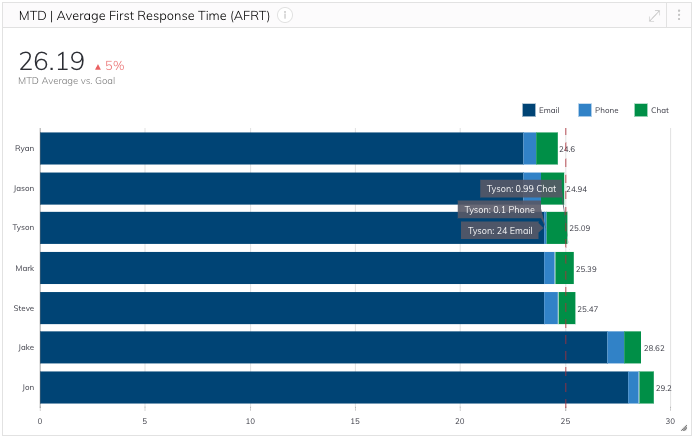
This metric shows the average time it takes for each customer service rep to respond to his/her customers via email, chat, and phone each day during that month. The amount of time it takes a rep to respond in each of the three channels each day is added together and should be close to 25 minutes, as shown by the dashed horizontal line. Reps should respond to each channel throughout the day and need to prioritize their time to ensure they meet appropriate service levels.
This metric provides a quick way to see how many reps are keeping a good balance between their three main responsibilities and are close to or below the set service level.
By reviewing the data above, you can see that Jake and Jan are each about four minutes above the set combined 25-minute FRT service level. It looks like the extra time is because of slower email responses and not slower chat or phone responses which should typically be attended much quicker than email.
There could be a few reasons for this. If you dig into the data, you might discover that Jake and Jan have more clients than the other reps which is making their average response time slower because they have more service requests to handle. More digging would be required to know for sure, though.
Viewing this data as a stacked bar chart is an easy way to see if reps’ overall performance meet or exceed acceptable service levels set by the company. By hovering over a specific rep’s bar, you can see the breakdown of what the average FRT is for each communication channel.
AFRT VS. CONTACT VOLUME METRIC

This metric shows the same data as the previous metric without segmenting their Average First Response Time (AFRT) data out by channel. Instead, it shows the total number of the three channels. Viewing this information as a column and line chart is an easy way to view a side by side comparison of each reps’ AFRT with the number of service requests received. This metric helps you better understand each rep’s ability to handle his/her workload. The numbers on the left side of the column represent minutes and the numbers on the right side represent contact volume.
If you were over this team, you’d see that Jason and Steve are fielding the most service requests and still maintaining good service level. You should look into how they accomplish that so you can teach their methods to the rest of the team. You’d also see that Jake and Jan are handling a similar amount of service requests as other reps, but their service level does not meet the FRT standard. This would be another thing you’d want to look into.
CHAT AFRT VS. CHAT VOLUME METRIC

This metric also uses a column and line setup. The difference is that it shows the data for one specific channel of contact, in this case, chat. The numbers on the left side of the chart represent minutes and the numbers on the right side of the chart represent the number of chats.
The previous metric showed Jan as having a combined response time below the SLA standard. However, this metric shows that for chat Jan had the best response time out of all of the reps while still receiving significant chat volume.
By reviewing this chart, you will also see that Jason is the slowest for chat but still within acceptable chat response times (one minute and 36 seconds). By reviewing one of the previously shown metrics, you will see he has one of the lowest combined response times out of all of the reps.
Similar graphs can also be created to view the data from the other support channels to see if reps are meeting the SLA.
How do you calculate First Response Time?
To calculate your average FRT per channel, take the total of all of the response times from a channel and divide it by the number of service requests received during that time. Occasionally, outliers can skew the data so it can be a good idea to calculate based on of the median and not the average.
How do I create a First Response Time metric?
The metrics shown above were created with Grow. There are a few ways to pull the information you need to create the metrics shown above. A lot of call center-type software pushes data right into a database that someone can then query. Grow also integrates directly with call-logging software like Five9 and CallRail.
To get your chat response data, Grow integrates with chat software like Intercom, Zendesk, and Freshservice.
To get your email response data, Grow can also pull info from Zendesk, Freshservice, or a CRM that records inbound and outbound emails with a time stamp. We use Salesforce to track our email response data.
To see if Grow integrates with the customer support platform you use, view our integrations here.


