For a quick-and-easy guide to effective chart selection, check out our infographic:
Data Storytelling 101: How to Choose the Right Chart to Visualize Your Data
At Grow, we make your data accessible with charts and graphs so you can accelerate your company’s growth and tell impactful data stories. But if your charts aren’t optimized for visual communication, your stories (and growth trajectory) just might fall flat.
As Stephen Few, an expert on data visualization design, has said:
“Inattention to the design … results in a huge hidden cost to most businesses. Time is wasted struggling to understand the meaning and significance of the numbers—time that could be better spent doing something about them.”
(Show Me the Numbers, 2004)
To avoid that time waste, you have to be able to design effective and efficient charts, and in order to do that, it helps to know how the visual and memory systems work. These systems are governed by hard-earned evolutionary rules, but once you understand them, you can easily tap into the remarkable power of visual perception.
The Eyes Have It
If you haven’t been in a biology class recently, here’s a quick refresher on vision: Your eyes gather and record visual information to send to the brain by capturing light. To do this, a muscle called the iris expands and contracts to control the amount of light that’s allowed to enter through an opening called the pupil.


From there, the light passes through the lens, which adjusts the eye’s focus on near or distant objects. Focused light shines on the retina, the interior surface of the eye, which is covered with photosensitive (i.e., light-sensitive) neurons called rods and cones.
Rods and cones interpret light for the brain. Rods are extremely sensitive and can sense very low levels of light, but they do not detect color. This is why the world looks black and white when it’s dark. Cones, on the other hand, require brighter light to function but do confer color information. Together, rods and cones encode this information as electrochemical signals to send to the brain via the optic nerve.
A TRIP DOWN MEMORY LANE
Once the eyes translate light into neural signals, the brain must assemble them into a cohesive image you can understand. (This is why it’s sometimes said that we don’t see images with our eyes, we see them with our brains.)
When visual neural signals arrive in the brain, they are processed first by the sensory memory. This happens automatically and unconsciously—it takes less than half a second. If the sensory memory determines a piece of information to be interesting, it is passed to the working memory. Otherwise, it is discarded.

The working memory (also called the short-term memory) is where active thinking occurs. This part of the memory can juggle a few items at once and retain information for up to 60 seconds. If it’s consciously rehearsed, information can be retained for several hours or stored permanently in the long-term memory.
The long-term memory is where all of our knowledge, skills, and past experiences are held for later use. Some information is unconsciously stored in the long-term memory, and other things we remember deliberately. (The complete remembering process is, of course, much more complex than we can explain here.) This vast repository helps us recognize patterns and familiar images, and thus can speed up our perception.
The Power of Preattentive Processing

The real power of perception, however, is the sensory memory. Without it, we would have to consciously process everything we see (or hear, taste, smell, or touch) in our working memory. Remember, the working memory has a limited capacity and duration. This burden would be enormous and overwhelming.
Sensory memory lifts the burden with “preattentive” attributes of form, color, position, and motion. In other words, we can detect movement or spot differences before our working memory consciously processes it.
SEE FOR YOURSELF
Not convinced? Here’s a quick demonstration you can complete on your own. All you have to do is count the number of sixes in the box below:
15732894163029481753296184237409837
41602394871523984910239847192340695
83274209169238475102934872019328471
92340918327481259603498273546420947
Because all the numbers are uniformly sized and colored, we have to process each number individually to identify the sixes.
But if we apply the preattentive attributes of color and width, the game changes. Count the sixes in this second box:
15732894163029481753296184237409837
41602394871523984910239847192340695
83274209169238475102934872019328471
92340918327481259603498273546420947
You likely noticed that you were able to count the sixes much faster that time. (Our team improved from 8+ seconds to only two!)
This is because your brain used hardwired shortcuts to rapidly distinguish the sixes from other numbers. And you didn’t even have to try.
Hacking Your Brain for Visual Communication

When you know how our brains want to process information, you can make better charts, graphs, and other visualizations. They’ll be easier to understand and more impactful for the viewer—whether that viewer is just you, or a room full of people.
In other words, you can hack your brain, and everyone else’s. (Yeah, we know. It’s pretty cool.)
Scientists have identified nearly forty types of visual attributes that your brain processes unconsciously. That’s quite a lot, and they aren’t all relevant to charts and graphs. But the ones that are fall into two groups: categorical (or qualitative) and quantitative.
CATEGORICAL ATTRIBUTES
In charts, categorical preattentive attributes help us differentiate categories, portions, data sets, etc. Check out how categorical attributes can be used in charts with the table below:
[table id=1 /]
Limits to using categorical attributes
Your sensory memory handles one attribute well, but when it has to deal with many attributes at once, your working memory has to pick up the slack.
With that in mind, avoid “over-designing” your charts and only include elements that serve to make the data clear. As Edward Tufte, another data viz expert, has said: “Above all else, show the data.”
QUANTITATIVE ATTRIBUTES
Quantitative attributes help us see and understand quantities. See how quantitative attributes can be used in charts with the table below:
[table id=2 /]
A little more about length …
When it comes to attributes that communicate quantity, it’s hard to match length for effectiveness. However, our brains are wired to do that so well that length-based charts can easily distort our understanding. For example, look at the following two charts:
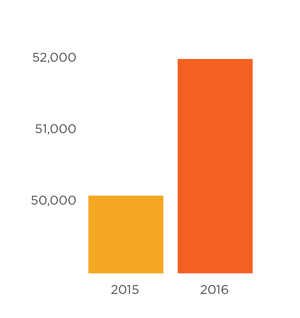

These two graphs are actually showing the same data, but the first chart makes the difference appear much greater—just take a look at the y-axis. That’s why it’s important to always start the y-axis at zero when using a bar or column chart.
But, you may protest, that second chart isn’t very helpful, either! It makes the change almost invisible!
There is an easy solution. When large numbers render your column charts useless, you have limited space to work with, or you need to home in on the finer details, a line chart with an adjusted axis is an appropriate fix, as shown below:

It’s still important to call out the adjusted axis to your audience, but since the attribute of length is less prominent on a line chart, viewers are less likely to be misled.
USING PREATTENTIVE ATTRIBUTES FOR EMPHASIS
Some attributes can also be used to emphasize important values. Typically, any change from the norm will grab our attention. But there are a few common assumptions you should be aware of when creating charts:
[table id=3 /]
Remember: You want your message to be clear, so you should only emphasize the most important information. If everything is emphasized, nothing will stand out, and your viewer is likely to experience visual (that is, sensory memory!) overload.
GESTALT PRINCIPLES OF VISUAL PERCEPTION
There are other rules and tricks of perception we can use while designing charts and graphs.
In the 1920s, German psychologists studied how we tend to organize visual elements. They named these principles with a term from psychology, Gestalt, which means “unified whole.” Use these six Gestalt principles for better visual organization:
[table id=4 /]
So what now?
Together, these rules explain how we perceive visual information, including data on charts and graphs. Now that you understand them, you can ensure that your most important data is displayed to have the most effective, highest impact. For a quick, easy reference, download your copy of our infographic Data Storytelling 101: How to Choose the Right Chart to Visualize Your Data, or check out the interactive Choose the Right Chart online tool.


